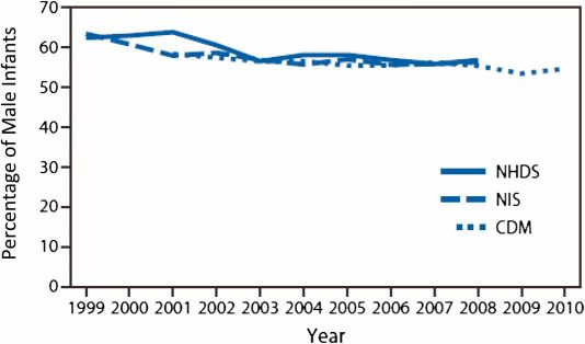
In the AAP’s technical report supporting its revised policy statement on non-therapeutic male child circumcision, there is a graph depicting the recent trend in circumcision rates, as shown in three studies. The graph is on page 759. Here it is:
As Hugh notes¹ in his annotated version (pdf):
This chart suppresses 100%, making a near 50:50 split look like a large majority.
I edited the original graph to add the missing 30%. (I copied the the bars covering thirty percent and added them above the seventy percent marker.) It provides a different perspective on the current rate.
The difference isn’t huge, and is hardly the most compelling point against the AAP statement. (Neither is the missing 71-100% above.) But it’s difficult to accept that the space saved by stopping at 70% is an acceptable trade-off for the flawed perspective the original chart could create.
¹ As he also points out, the chart begins in 1999. This is not necessarily an egregious decision because they’re relying on studies that look at that time period. Data for the years and decades prior to this is available (pdf), of course, and shows a larger decline in the newborn circumcision rate over the last few decades.

